I Had COVID-19


It was mid-June. We had been cooped up in the house for the better part of three months, leaving only to pick up our pre-ordered and bagged groceries, the occasional birthday parade and one socially distanced/isolated trip. In a few weeks, my wife would turn 40 years (she doesn’t look a day over 30). She is an incredible woman and I wanted to celebrate her. We had already had an all-inclusive birthday beach getaway cancelled and we hadn’t socialized much with anybody. A neighbor suggested that we have a get-together to celebrate. In thinking it through, I told my neighbor “I literally don’t know a single person with COVID-19 – not a single person”. We decided to proceed with the plans. It would be small, neighbors only, and we would try to keep to the outside.
On Saturday, June 27, we had the party. There were around 20 people from our cul-de-sac only. We played yard games like Cornhole and Spikeball and just enjoyed being around other people. Some people congregated a bit inside to play cards and other games. It was a good day.
The next day started like any other Sunday (well, any other Sunday amidst a Pandemic) with a virtual church service and a bit of family time. In the late afternoon, my kids decided to ride their bikes to the park and I decided I would run to the park and meet them.
Running used to be quite important to me. It was a great way to keep in shape while relieving stress and it also got my competitive juices flowing; I continually tried to be my previous best. I ran three half marathons, several 15Ks and numerous 5Ks. Although running was no longer an addiction, I still did it a couple times per week to stay in shape. Running four or five miles was no problem for me.
My kids took off on their bikes and I started on foot. To my surprise, about a tenth of a mile into this four mile run, my chest started burning as my body struggled to push enough oxygen into my lungs. It was a very hot day, in the mid-90’s and quite humid, so I figured that was the reason. I continued to run and the burning in my lungs continued to worsen. I took a short break to catch my breath and cool down. About 5 minutes later, I resumed my run, this time up a large hill. My lungs started burning again and the burn immediately moved to my back. I tried to push through, but could not. I called my wife on my cell phone and said, “I have COVID-19”.
The next day I developed a headache, some congestion, minor body aches, and started to feel fatigued. I hoped it was just a sinus infection, something that I contracted quite often. The following day, my symptoms worsened. I decided that I would be tested. My wife had some congestion, so she thought it would be best if she were tested also.
We scheduled an appointment with the local Urgent Care office and drove together to our appointment. The nurse instructed us to stay in our car. She came to our car dawned with her COVID-19 armor and swabbed my wife’s nose then mine. It felt like she had swabbed my brain and it burned like nothing I’ve ever felt before. They said it could take up to four days to get results. We left the office prayerfully hoping our symptoms were simply a coincidence.
The next evening, while my eyes were barely open watching television with my kids on the couch, I received a phone call. The voice on the other end introduced herself as a nurse from Urgent Care and then uttered the words, “You are positive for COVID-19”. Wow. Although we’ve heard that COVID-19 has a much greater impact on older people, smokers, or people with asthma, we’ve also heard about incredibly healthy people in their 20’s going on ventilators and dying. It was a scary thing to hear. My wife received a call shortly thereafter telling her that she was negative. I packed up some stuff and moved to the basement as an effort to keep anybody else in my family from getting sick.
The next day, I felt well enough to work so I set up a makeshift workstation using my laptop, an old monitor, and a foldout card table. To start the workday, I messaged my superiors to let them know I had tested positive. After some well wishes, one of them suggested that I “track the data”. Wow…what a great idea! I’d track the data and create a visualization using Tableau. I had previously seen thousands of COVID-19 related visualizations that focused on cases and deaths in countries, states, counties and cities. All of the visualizations looked at aggregations of people in the hundreds, thousands, and millions. However, I had not seen a single visualization from the perspective of someone with the disease.
I was tentative at first. I didn’t want this to look like I was searching for sympathy. If I did it, I wanted it to be something where people could learn from it. I wanted it to be something that people could see from the perspective of a human being, not a number. I wanted it to be something that would help others.
I went to bed that evening (my “bed” was a spare twin size mattress from my son’s trundle strewn on the basement floor); I tossed and turned, not because I was sick, but because my brain was churning on ideas of what I could track and how I could visualize that information. I decided to keep it simple and track my symptoms. This would be done via a simple timeline that would reveal how I was feeling (in my own words) as well as track my symptoms on a scale of 0-10 each day (0 being no symptoms and 10 being the worst). I actually even got out of bed around 1:00 AM to draw what it might look like.
The next evening, I looked up symptoms on the CDC site; there were 11 in total. I then created a spreadsheet that listed each symptom along with a column for a daily ranking. I connected to that data in Tableau and started visualizing it.
I opted to show a simple timeline at the top displaying each day starting with the day of the party. Each day, I wrote a short paragraph of how I felt on that particular day and/or what happened that day. This could be accessed on hover.
At the bottom, I decided to track each symptom’s 0-10 ranking over time using an area chart. The area charts were done as small multiples. Although small multiples are quite “efficient”, they do come with the issue that they can be difficult to compare. For example, it is difficult to compare a chart at the top left to a chart at the bottom right. To make this a bit easier, I added a reference line, a few calculations, and a parameter action. When a user hovered over a day in the timeline, the reference line would show at that day across all area charts and a label would show the actual ranking value (for that day only).
I wanted to be careful on the design and color usage. I didn’t want it to be colorful or bright. I wanted it to be somewhat somber and taken seriously. I made the choice to have a dark background and blue text. This may be a bit controversial in dataviz, as it doesn’t allow enough contrast to be legible and properly accessible. I agree with this sentiment completely. However, I thought that keeping this viz somber was incredibly important. I did ultimately lighten the text quite a bit to improve contrast, because I wanted the visualization to be accessible to everyone.
When I shared the viz on Tableau Public and social media, it blew up. It received 3000 views in 24 hours. People were generally concerned about my well-being and I received hundreds of get-well messages. A few people, which I did not know that well previously, contacted me every single day (and we are now good friends). I learned that many of my family members (aunts, uncles, cousins) were logging onto Tableau Public daily to check the viz to see how I was doing (although they had no idea what Tableau was). But the viz didn’t just keep people up to date on my status, it also generated awareness – awareness of how tough this can be and awareness that this is REAL. Do you remember my earlier statement about not knowing anybody with COVID-19? Well, thousands of people now knew someone.
I tracked my symptoms for a period of 30 days. At that point, I would have considered myself at about 90% of where I was prior to contracting the disease, although I still had lingering symptoms such as a mild cough, congestion, and about 50% of my taste. After that time, things continued to improve and after about 45 days, I would have considered myself at nearly 100%. It was then that I changed the viz to a white background and updated the title to be “I HAD COVID-19”. The idea was to represent going from bad to good, darkness to light.
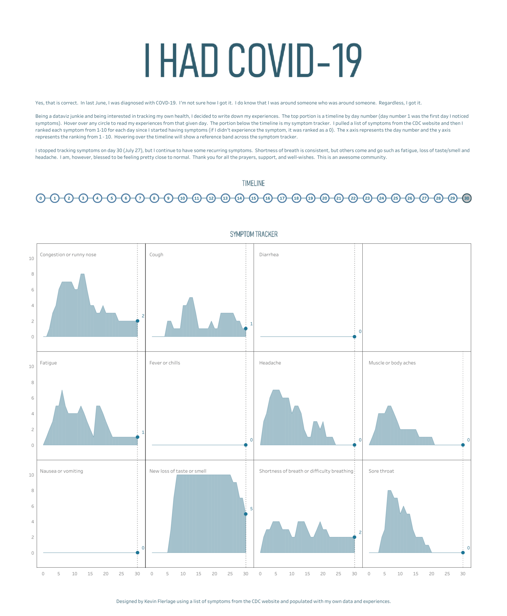
If you dig into the viz, you can really see the peaks of when my symptoms were their worst. On day four, my headaches became brutal (in hindsight, I probably should have ranked them higher than a 7). A couple of days later, the fatigue, body aches, and sore throat reached their peaks. From there, my congestion starting to increase followed by an irritating, dry cough. After about two weeks, many of my symptoms started to subside and I began to socialize a bit more with my family. I recall that weekend was quite good. However, a few days later, as I learned was common with sufferers of COVID-19, I had a relapse. Although at a lesser scale, nearly all my symptoms returned. This lasted four or five days, but things began to improve and luckily, they did not return. After 30 days, I decided to stop tracking symptoms with my self-diagnosis of “healed”.
There are a couple of very interesting things that come to the surface when you look at this data. First, many companies are requiring their employees to take their temperature before entering the building. This seems to be their first line of defense against the spread. However, I never had a fever. I checked every single day and it never wavered from normal. I’ve heard this from many people that had COVID-19.
You’ll also notice that my highest rated symptom and the one that lasted the longest was my loss of taste and smell. On day 6, I began to notice a dulling in my taste; I rated it a three on a scale of 0 – 10. By day 8, I had absolutely no taste or smell. This lasted for 2.5 weeks before I started to regain it. By day 30, about 50% of my taste had returned. Although I did not track past day 30, my taste returned fully a couple days later.
In the midst of it, my daughter and I decided to have a bit of fun with this symptom. We started recording videos of me eating horrendous food combinations since, after all, I could not taste a thing. It started out as a test of whether taste was purely physical or partially mental. We selected my two most hated foods – raw onions and mustard. My daughter cut up some onions, smothered them in mustard, and then scooped up this food abomination for me to eat. I put it into my mouth and nothing. I couldn’t taste a thing, couldn’t sense a thing, and honestly, I wouldn’t have been able to even tell the contents had I not witnessed its preparation. We made several other videos including chocolate syrup on mashed potatoes and the famous ice cream topping. These videos were very popular on Twitter and you are welcome to watch them here: Mustard & Onions, Mashed Potato Sundae and Ice Cream Topping.
Although we had a little fun with it, COVID-19 is certainly no joking matter. The disease has impacted millions of people. It was a rough road for me, but in the end, I feel incredibly blessed to be healthy and nearly 100% back to normal.
Sharing my experience with the community truly shows the power of data visualization through Tableau. It allowed my friends and family to easily check on my status without feeling as if they were “bothering me” by calling or texting daily. It allowed me to help spread awareness of how the disease impacts an actual human being – it brought some humanism to the data and it was no longer just about the numbers. And I learned that our community is incredibly loving and uplifting. Thank you to all the people that sent me well-wishes and/or that checked on my weekly or daily. I’m blessed to be a part of this family.
Related Stories
After a year of COVID-19 charts, eight data communication lessons learned
 April 19, 2021
4 reasons why embedded analytics is your path to a new revenue stream in the COVID-19 era
This blog post covers four reasons why organizations should consider embedded analytics.
What we can learn from the public sector’s response to COVID-19
 May 21, 2020
A broad consensus is that COVID-19 will drive digital transformation in the public sector. During the 2020 Government Summit, speakers from Veteran Health Administration, Southwest Texas Regional Advisory Council, and FEMA discuss new processes, new technologies and innovations, and most importantly, a new mindset on decision making in the midst of crisis.
Subscribe to our blog
Get the latest Tableau updates in your inbox.